Posts

Showing posts from June, 2011

CONTEST

Just an FYI, the name is Batt. I forgot to cross the letters before scanning. Also, the stamps are fake, just for placement.

CONTEST

Image
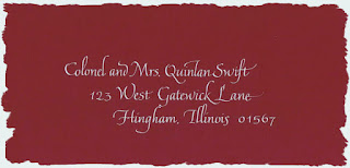
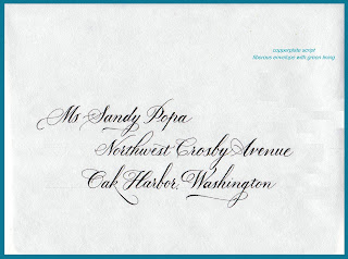
So, I was at the eye doctor this week. Love when they do that "which is better one or two, two or three, three or four" and "is this better, the same, or worse". Back and forth. One or Two. Two or One. I just finished my largest envelope job!!! 258 addresses!!! dip pen, copperplate. I was going through all of the envelopes for the final check before calling the MOB. Since I had two extra envelopes, I decided I just had to redo this one. And then I thought, would anyone else know the difference? Was it worth another 15 minutes? So, here is the contest - YOU decide which one is better one or two, two or one? Write a comment and vote for: Envelope ONE   OR Envelope TWO BONUS - can you figure out why I needed to redo? What is the prize? A laser print of: fits an 8 by 10 opening Contest ends July 18th (cause that is the birth date of my twins!) Winner will be selected the old fashion way, names written, placed in 'hat' and selected by one of the tw

Flourishing

Image
My twins are off at camp. They encourage parents to send mail . . . Hope they don't mark off for spelling.

flourishing

Image
Envelope after envelope after envelope . . . but to warm up, I can play a little:

Flashback to 1987

Image
Here is what time and practice can do for your calligraphy. This is Italic lettering.  Now, this is 'Italic' lettering from my first 'job' - my own wedding. I took one class (10 weeks long) and thought I was ready to address my wedding invitations. In my own defense, the paper was very rough! but here it is . . . Notice the postage stamp - 22 cents! in 1987.

Picking your envelopes wisely

Image
What looks gorgeous in the sample book, will be gorgeous but it may not be a calligraphers best friend. This is a lovely natural envelope - which means it has fibers!  Which means a calligrapher's tool will pick up little fibers that will drag the ink on the stroke.  Here is the close up of what happens: Look at the lower bowl of the 'a' - not what it is supposed to look like, but on the up stroke the fiber drags extra ink and causes that filled in bottom. These envelopes had another nasty problem. The green lining was dark enough that guidelines could not be seen and therefore, pencil lines needed to be put on each and every envelope. Then, due to the natural fibers of the paper, these pencil lines did not fully erase. NOW, most folks won't notice but for the me, the calligrapher, I noticed! And it just isn't the best presentation. Moral of my comments - think about how the addresses are going to be put on the envelopes and select paper accordingly!