Posts

Showing posts from 2011

BiltCandle Blog

Image
BiltCandle Blog , a photo by long village lettering on Flickr. Sending more notes of thanks to my favorite invitation stores in Asheville, NC. Candle pillar is from my new business as an Independent Consultant for Biltmore Inspirations - www.biltmoreinspirations.com/clangsdorf The Biltmore House in Asheville, NC is a beautiful setting for weddings. It is a top rated tourist attraction in Western North Carolina. If you haven't visited America's grandest home it is worth the trip to Asheville, NC. 

Giving Thanks

Image
Mailed my Thanksgiving Day cards today to thank a few people who have made a difference in my life this year. Our local veterinarian had his hands full with our two chihuahuas. He and his staff took terrific care of our little fellows. We are thankful to have another holiday with them both! Our older dog, Gizmo, is aging and struggling to breathe, but our vet is keeping him comfortable. Our youngster, Apollo, got into trouble this Fall by eating something toxic in the yard. But after a tough week, he his recovering.   This is one of my favorite lettering styles to spend time creating. It is a modern pointed pen hand.

In Every Thing Give Thanks

Image
Giving thanks for a wonderful Open Studio at my church! We had our second meeting today and played with leaf rubbings. After just 30 minutes of play I had completed this little piece. It was so refreshing to play and react and watch the art come to life. Ka-bam!

Resolution completed

Image
header , a photo by long village lettering on Flickr. I have just delivered this long resolution to the client. He provided me with a copy of the original piece and wanted a replica. Trying to match someone's layout and style was a bit challenging. However it was a good project. The client's response to the finished piece was priceless - not a word, but a tear in his eyes. A reminder why the hand-executed word is still important.  

world peace

Image
world peace c langsdorf blog , a photo by long village lettering on Flickr. Yes, this is a Zentangle Inspired Artwork - usually shared only on my other blog, but this one has some examples of my favorite type of lettering, built up capitals. Built up caps have long been a style that I spend time on. The solid black are very forgiving, stroke by stroke a letter is built and cleaned up. The ones with white space are not so forgiving, there is no going back once a line is placed. These letters go very naturally with Zentangle art.

Formal envelopes

Image
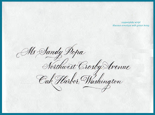
One of my most recent jobs from the summer of 2011. These were very traditional, formal envelopes. Simple copperplate with black ink. Very proper etiquette. The mother of the bride was so pleased with the response she got from those who received these invitations. Here is what the M-of-B sent in an email: Good morning Catherine,     You have gotten lots of compliments on your calligraphy !  Many people told me immediately when they received the invitations how lovely the calligraphy is !  It truly is stunning. One really good friend could not believe you did it by hand because it was so perfect ! Just goes to show, it is worth the effort!  

Creative Envelopes

Image
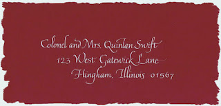
Here are some envelopes I created using two layers of paper and my newest style, Fraktur. My parents seemed to save everything. I found this old paper, which I seem to remember was called onion paper. It was used back in the days of the type writer, even before the electric one. Not being able to just recycle it, I thought that a double envelope might be fun. Step 1. On the inner layer, I wrote the first names in a dark(ish) color.  I tried to think about the layout of the address and stamp while placing the names. Step 2. I went ahead and placed the stamp ( I have a tendency   not to leave enough room and then wind up covering up some lettering with the stamp.) Then with a lighter color I wrote the last name. Added some flourishing with the corner of the marker. And then the diamonds with a contrasting color. I did a few more for an exchange . . . the paper is so nice to work on that I have gotten carried away!

Fraktur

Image
I love to attend workshops and get an opportunity to focus on calligraphy. Joyce hosted Barbara in July on a class on Fraktur. Not my first choice of topics, but to learn from Barbara Calzolari . . . too good to pass up. I was not disappointed! We started right to work on Friday and until the down pour on Sunday. I am actually enjoying using this style!  The capitals continue to challenge me, but in time . . . so here are some of my practice pages:

Wedding painting

Image
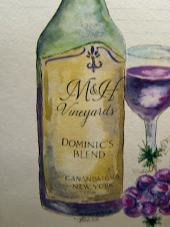
Just finished working on a wedding painting.  Watercolor work by Patty Swider, Calligraphy by me. This is just a part of the painting. This will be used as the guest registry instead of a book. The couple will then have this great framed piece to hang in the new home. The label is their initials, the name of the wine is their son's name, and the location of the wedding is on the bottom. Very personalized. To view the whole piece click on the top tab - Wedding Extras. Calligraphy for weddings is my favorite way to use my gift of hand lettering.

Fraktur/Gothic/Black Letter

Image
 Barbara Calzolari from Italy will teach Passion for Calligraphy       I am packing up for a wonderful workshop! Hosted by Joyce Teta and taught by Barbara. Can not wait to get a refresher in this style and perhaps even be able to create decent letters. Time will tell.  Joyce was my first mentor. Someone who has been such a great influence on me for letters and for life. She is a gem! She is amazing! and I am truly blessed to know her. She is very talented and has always given freely her knowledge of calligraphy of her love of letters! Visit her blog and you will see what I mean.

Calligraphy for wedding

Image
Just finished my envelope marathon. Three jobs, 570 sets of wedding envelopes using copperplate. Time to give my hand and eyes a break. This envelope was one of the last. Just loved how this address got the full value for the cost of the line!  What runs through my mind when I'm doing envelope after envelope . . . who makes up these addresses???  It is like how small 'they' make the lines on forms.  Did 'anyone' really think about how loooong this address is?  And the client wanted the Junior spelled out - where? There were other addresses that just made me wonder as well. Need to keep a book on them, puts a smile on the face  when I come across some of them :)

The WINNER

Image
Thank you for all the comments and votes on this envelope contest! The envelope that I gave to the client was envelope #1 The vote was 15(for this one) to 9(for #2).  Very interesting.  The reason I had to redo #2 was the letter 'g' in August on the first line. As Jane Farr so correctly figured out - " Maybe the "g" in August was started as an "s" - the error was caught in time to transform it into a modified "g"."  This job was so tight on envelopes, only 6% extra, that I had to finish it up and hope at the end to redo it. Seven folks mentioned that pesky 'g' - mixed reviews.  The second reason I wanted to redo was the line spacing. I like deeper indents when the lines are short. Got to give extra credit points to Beth Lee who did some research - "Clearly, you abandoned envelope #2, not even bothering to cross the t's. (And Google shows that Batt is the proper surname for that address.) I guess that the "g" i

Contest Reminder

Image
One week left until I draw the name of the winner for the PEACE print. Go to the post dated 6-29-2011 and enter!

CONTEST

Just an FYI, the name is Batt. I forgot to cross the letters before scanning. Also, the stamps are fake, just for placement.

CONTEST

Image
So, I was at the eye doctor this week. Love when they do that "which is better one or two, two or three, three or four" and "is this better, the same, or worse". Back and forth. One or Two. Two or One. I just finished my largest envelope job!!! 258 addresses!!! dip pen, copperplate. I was going through all of the envelopes for the final check before calling the MOB. Since I had two extra envelopes, I decided I just had to redo this one. And then I thought, would anyone else know the difference? Was it worth another 15 minutes? So, here is the contest - YOU decide which one is better one or two, two or one? Write a comment and vote for: Envelope ONE   OR Envelope TWO BONUS - can you figure out why I needed to redo? What is the prize? A laser print of: fits an 8 by 10 opening Contest ends July 18th (cause that is the birth date of my twins!) Winner will be selected the old fashion way, names written, placed in 'hat' and selected by one of the tw

Flourishing

Image
My twins are off at camp. They encourage parents to send mail . . . Hope they don't mark off for spelling.

flourishing

Image
Envelope after envelope after envelope . . . but to warm up, I can play a little:

Flashback to 1987

Image
Here is what time and practice can do for your calligraphy. This is Italic lettering.  Now, this is 'Italic' lettering from my first 'job' - my own wedding. I took one class (10 weeks long) and thought I was ready to address my wedding invitations. In my own defense, the paper was very rough! but here it is . . . Notice the postage stamp - 22 cents! in 1987.

Picking your envelopes wisely

Image
What looks gorgeous in the sample book, will be gorgeous but it may not be a calligraphers best friend. This is a lovely natural envelope - which means it has fibers!  Which means a calligrapher's tool will pick up little fibers that will drag the ink on the stroke.  Here is the close up of what happens: Look at the lower bowl of the 'a' - not what it is supposed to look like, but on the up stroke the fiber drags extra ink and causes that filled in bottom. These envelopes had another nasty problem. The green lining was dark enough that guidelines could not be seen and therefore, pencil lines needed to be put on each and every envelope. Then, due to the natural fibers of the paper, these pencil lines did not fully erase. NOW, most folks won't notice but for the me, the calligrapher, I noticed! And it just isn't the best presentation. Moral of my comments - think about how the addresses are going to be put on the envelopes and select paper accordingly!

Wedding season

Image
Must be that time . . . deadlines are approaching and jobs are coming in . . .  Congratulations to all those  excited brides, nervous grooms and proud parents!!!

Baby Beluga

Image
Cleaning out . . . really procrastinating . . .  but sounds better to be 'organizing' So, I came across this piece I did as play. What year? Who knows! Just a reminder that I really should put a date on things. Best guess would be around 14 years ago because this is a book we purchased when we knew we were expecting our first child (TWINS). I can clearly see two influences in this piece. Peter Thornton with the Roman caps. Mike Kesceg with the pointed pen letters. This one had no sketch, plan or prediction of how it might turn out . . . but here it is:
Image
A simple post - may there be laughter in your day! Create daily!

Wedding Program

Image
I have been working with a watercolorist on wedding paintings for many years. They are lovely paintings on a full sheet of watercolor paper. I add the calligraphy giving the basic wedding info - bride, groom, date and location. Then the final piece is that it is used as the guest registry and everyone signs their names. It makes for a great keepsake. Last week I completed a variation on the theme. A bride wanted a large program posted as guests came to the wedding ceremony. Going green, she did not want to print programs only to see them thrown away. So, I created the program and left plenty of white space so that the guests could sign the piece during the reception. It was a hit! The paper was tucked inside four large gold photo corners. The couple was able to remove and roll it up to make traveling with it easier. They will then frame it for their home as a wonderful keepsake of their wedding.   Unfortunately, my photography skills are lacking . . . but hopefully the idea is the

Simple Elegance - monoline copperplate

Image
A couple put their hearts and dreams into every part of their upcoming occasion. Making so many decisions to help put their personal touch on their special day. I am always pleased when I can be a part of that. It is an honor to help them create the first impression that friends and family are going to have of their occasion. Many see their invitations as an investment in the total package for their wedding day. I'm delighted when individuals realize the value of hand-lettered envelopes on their invitations. Realizing that families have budgets, I have a solution to fit calligraphy into the budget and give their invitations an elegant feel. Mono-line calligraphy can be hand crafted quicker and yet provide the style needed to set their envelopes apart. These samples are from a job fresh off the art table.  They were done using mono-line copperplate .  A simple elegance for their traditional ivory panel invitation.

Calligraphy in pencil

Image
I was enjoying my pencils so much that I just continued . . .  There is something so wonderful about a pencil. It seems more forgiving than ink. I feel more relaxed with a pencil in my hand than chisel and ink.  I have to give a shout out to my teacher/inspiration, Peter Thornton.  His workshops have always amazed me and given me the opportunity to better understand letterforms.

Pencil Examplar

Image
TaDa! After two years, I do believe it is done. I added some pencil washes, more letters, black mat and two drawn pencils & sharpener. I would love feedback. While I have not posted the complete finished piece, I think you can piece it together based other post. This is all done with graphite pencils. I am building the courage to submit this to a magazine for publication. So any thoughts would be helpful! I'm getting excited for a busy spring with several wedding jobs & another teaching gig.

Studio time

Image
Another good work session at the Conn-Artist Gallery. While I wound up avoiding the main project I planned to work on, I did a lot of lettering. You may recognize this piece. I started it 2 summers ago while my daughter was taking skate board lessons. I've pulled it out again. Adding more lettering. A work in progress. Contemplating sending it to Somerset Studio for their Lively Art of Lettering section.

Peace Lantern

Image
This project is moving along. It has been assembled into the four-sided lantern. Just want to add some tassels and an inner lantern.  The colors are light, to me peace does not scream - it is soft, quiet, calm. I wanted the colors to reflect that in this piece.

Name tags with parallel pen

Image
Just a short post to share some name tags done with the Pilot Parallel Pen. Hoping to offer a class at the local art store, who sells these wonderful tools. Until then, I'll just keep playing with them and enjoying the color! If you don't know what this wonderful tool is, go to Paper & Ink Arts to see the tool, some art, and the book available.